Feature #10271
closed
Large number of VLAN/LANs make "Interfaces" menu hard to access
0%
Description
On our datacenter cluster we have a large number of VLANs and LANs (and we aren't close to finishing work - we have around 12-15 still to create).
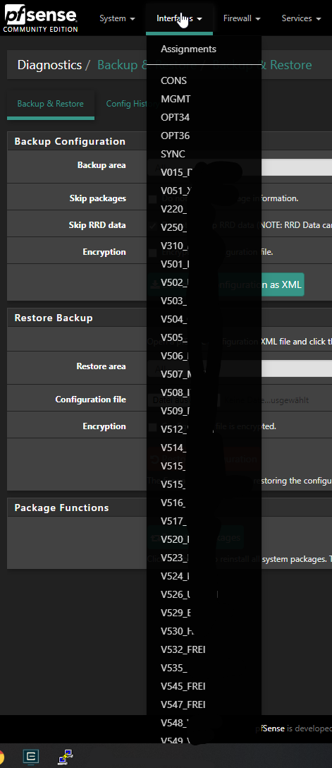
That makes the Interfaces menu hard to access or even impossible as in some corner cases, the menu will shut close if you have to scroll down to one of the last ones. A menu that long that you have to scroll the page with your mouse-wheel or pgdown is bad in itself but it makes using the UI hard. (see screenshot and that's a 24" 1920x1200 screen...)
So I'd suggest that for larger numbers of interfaces they are either arranged in submenus (doesn't make that menu better :/) or disable listing it and only show some sort of "interface select" with a page, that like the Assignments screen shows all interfaces to click to go to their details. Another possibility (and as large and wider screens get more traction these days) would be for either the default theme or like another one of those beta themes to include a menu that stays left or right of the screen. With it being bootstrap and fluid that shouldn't be hard to achieve. And besides I'm not being a huge fan of the sorting and collection of menu sections and trees in e.g. OPNsense, the basic layout of the menu being on the side brings much more flexibility to the table when having growing numbers of interfaces.
As same problem is apparent in firewall rules with the tabs being switched over to a dropdown after some limit is arrived, that also could be "mitigated" by having a left- or right-hand menu with interfaces/tabs being submenu entries. Not saying to exactly copy from others but adapt and cherry pick as we have quite a few larger customers that started segmenting/micro separating their networks and have a multitude of VLANs now flying around and find that additionally harder and harder to handle with pfSense's current style of displaying interfaces in the menu or in firewall rules.
Because the menu sometimes close/moves when scrolling the page I sorted this under "Bugs" as it can get really annoying of you want to quickly work your way through several interfaces that are all at the bottom of this list where you have to scroll.
Files
Related issues
 Updated by Patrik Stahlman over 2 years ago
This issues has also been reported here: https://redmine.pfsense.org/issues/7943 and includes a simple change until Netgate fixes this officially.
 Updated by Marcos M over 2 years ago
- Is duplicate of Feature #7943: Overflow scrolling for top navigation drop-down menus in Fixed mode added
 Updated by Jens Groh over 2 years ago
As far as I understand it is not a duplicate. The other linked topic talks about the problem with the top menubar being fix/dynamic and thus the problem.
I'm talking about our datacenter with about 100 VLANs configured and there it's really annoying and void if I can scroll in the menu container or scroll the whole page, scrolling 2-3 screen heights down to find the VLAN you're looking for is simply not workable either way. It's simply a problem with popping up all VLANs into one big column. But that's a general UX problem ATM of various elements and without changing the theme in some way I don't see a really good option besides some JS logic, that would make a multi-column output of the submenu in a smaller font so everything fits on the same page :)
But if you deem that duplicate because of the underlaying UX problem, that's fine, too.
Updated by Marcos M over 2 years ago
- Tracker changed from Bug to Feature
- Status changed from Duplicate to Feedback
- Priority changed from Normal to Low
- Affected Version deleted (
All)
With the overflow fix in, handling this likely requires a longer-term general UX change.
 Updated by Jim Pingle over 2 years ago
- Status changed from Feedback to Resolved
It's much better on the current snap (with that merge included). No longer double scrolls the menu when it's in the default mode.