Todo #14194
closed
Better colours for alerts
0%
Description
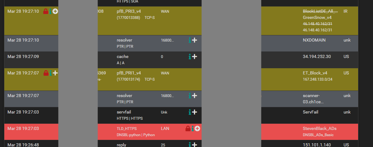
on the page Firewall --> pfBlockerNG --> Reports --> unified (and others)
pfBlocker uses
- 'Red' for traffic starting in my network
- 'Green' from traffic starting on the internet
- Red = bad
- Green = good
But both of these are bad/alerts, yellow and blue maybe
Files
 Updated by Jim Pingle over 3 years ago
Green and Red are also not great choices because some people are red/green color blind, so ideally whatever colors are chosen should also be distinguished in some other way (e.g. an icon that accompanies the color)
 Updated by Sergei Shablovsky over 3 years ago
Jim Pingle wrote in #note-1:
Green and Red are also not great choices because some people are red/green color blind, so ideally whatever colors are chosen should also be distinguished in some other way (e.g. an icon that accompanies the color)
1.
The total number on a planet peoples with daltonism & ahromaiopsia together are not more 8% for man’s (primary north Europe) and not more 0,5% for woman (the same max in Northern Europe).
But this is MAX on whole earth. And in condition when >87% of pfSense users are more in well-economic Western countries (USA, GB, DE, FR), the number of daltonics / ahromaiopsia users inside whole pfSense user base are inside 0.1-0.3%.
Are You REALLY like to stay on the position when WebGUI of pfSense may be less comfortable for rest 99% ?
2.
As the “cutting edge solution” may be using GRAYED BACKGROUND only for ERRORS / ALARMS ?
Updated by Jim Pingle over 3 years ago
Sergei Shablovsky wrote in #note-2:
Jim Pingle wrote in #note-1:
Green and Red are also not great choices because some people are red/green color blind, so ideally whatever colors are chosen should also be distinguished in some other way (e.g. an icon that accompanies the color)
1.
The total number on a planet peoples with daltonism & ahromaiopsia together are not more 8% for man’s (primary north Europe) and not more 0,5% for woman (the same max in Northern Europe).
But this is MAX on whole earth. And in condition when >87% of pfSense users are more in well-economic Western countries (USA, GB, DE, FR), the number of daltonics / ahromaiopsia users inside whole pfSense user base are inside 0.1-0.3%.Are You REALLY like to stay on the position when WebGUI of pfSense may be less comfortable for rest 99% ?
Ignoring disabilities because of dubious statistical analysis is not a good practice. Given the choice I will always err on the side of accessibility and inclusion. There is zero harm in using additional indicators (iconography, patterns, different colors) and the result is an easier to view and use GUI for everyone. If you don't like the color choices you are free to make your own theme that suits you.
2. As the “cutting edge solution” may be using GRAYED BACKGROUND only for ERRORS / ALARMS ?
Not sure what you're getting at here. If icons are added to correspond to various states the color isn't as much of a factor, but yes, gray for an error/alarm state isn't a great choice either.
 Updated by BBcan177 . 10 months ago
All the Colors can be modified by the user in the "Alerts Settings" section in the Alerts/Reports Page GUI.
 Updated by
  Updated by