Actions
Bug #17024
open
Certificate renewal page uses a hard-to-read contrast style
Status:
Confirmed
Priority:
Normal
Assignee:
-
Category:
Certificates
Target version:
-
Start date:
Due date:
% Done:
0%
Estimated time:
Plus Target Version:
Release Notes:
Default
Affected Version:
Affected Architecture:
Description
The page for renewing certificates uses a contrast in dark mode that makes the table header hard to read.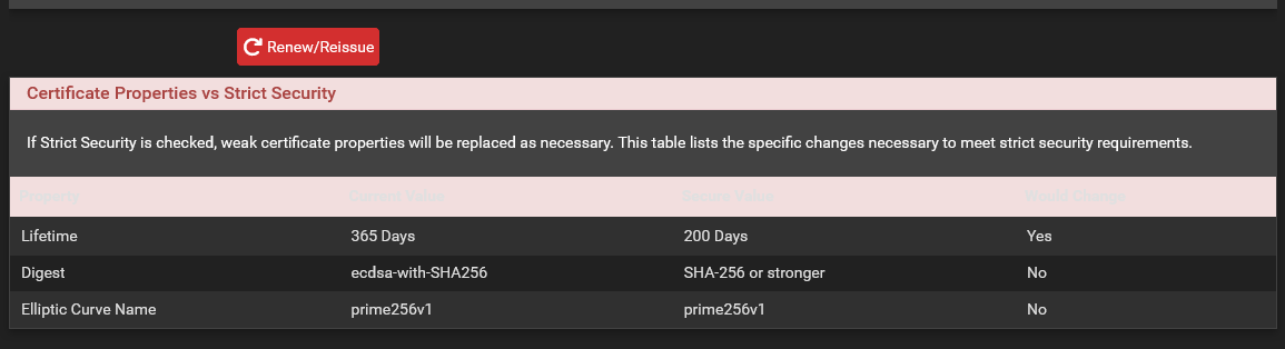
Files
 Updated by Christopher Cope 3 days ago
- Status changed from New to Confirmed
For a bit I couldn't even tell that anything was hard to read, because I couldn't see it.
Tested on
26.07-RELEASE (amd64)
built on Fri Aug 7 19:26:00 UTC 2026
FreeBSD 16.0-CURRENT
Marking confirmed.
Actions
Also available in: Atom