Actions
Bug #13448
closedTable row selection has poor contrast in Dark theme
Start date:
Due date:
% Done:
100%
Estimated time:
Plus Target Version:
23.01
Release Notes:
Default
Affected Version:
2.6.0
Affected Architecture:
Description
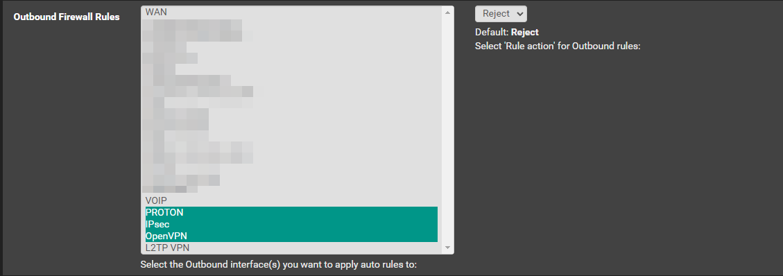
In UI that uses a table, and requires selecting a row (like with pfBlockerNG under IP > IP Interface/Rules Configuration) the colour of a selected row vs an unselected row is totally indistinguishable with the dark theme.
See attached screenshots, in both themes the same rows are selected, namely "WAN" in the top table, and "LAN" in the bottom table. With the dark theme it looks like nothing is selected.
Files
 Updated by Christopher Cope over 3 years ago
- Status changed from New to Pull Request Review
- Assignee set to Christopher Cope
 Updated by Christopher Cope over 3 years ago
- Status changed from Pull Request Review to Feedback
Merged.
 Updated by odo maitre over 3 years ago
Christopher Cope wrote in #note-1:
https://gitlab.netgate.com/pfSense/pfSense/-/merge_requests/855
What was merged? This link is not functional.
 Updated by Lev Prokofev over 3 years ago
- File 855.diff 855.diff added
- File clipboard-202209021532-v63um.png clipboard-202209021532-v63um.png added
The color changed to #009688
Looks much better.

 Updated by odo maitre over 3 years ago
Lev Prokofev wrote in #note-4:
The color changed to #009688
Indeed - thank you! (Also for the 855.diff )
 Updated by Christopher Cope over 3 years ago
- Status changed from Feedback to Resolved
 Updated by Jim Pingle over 3 years ago
- Subject changed from table selection has impossibly poor contrast in dark theme to Table row selection has poor contrast in Dark theme
- Target version set to 2.7.0
- % Done changed from 0 to 100
- Plus Target Version set to 23.01
Actions